AI Atlas Redesign
Redesigning CNET’s AI content destination to improve discoverability, deepen engagement and unlock sponsorship value, all under real engineering constraints.
A new destination for AI content
AI Atlas is a CNET initiative that pulls all of our AI coverage into one destination and creates a high-value surface for sponsorship. Early performance showed strong traffic, but content discovery was weak and engagement was shallow, which limited both the value to users and the sponsorship potential.
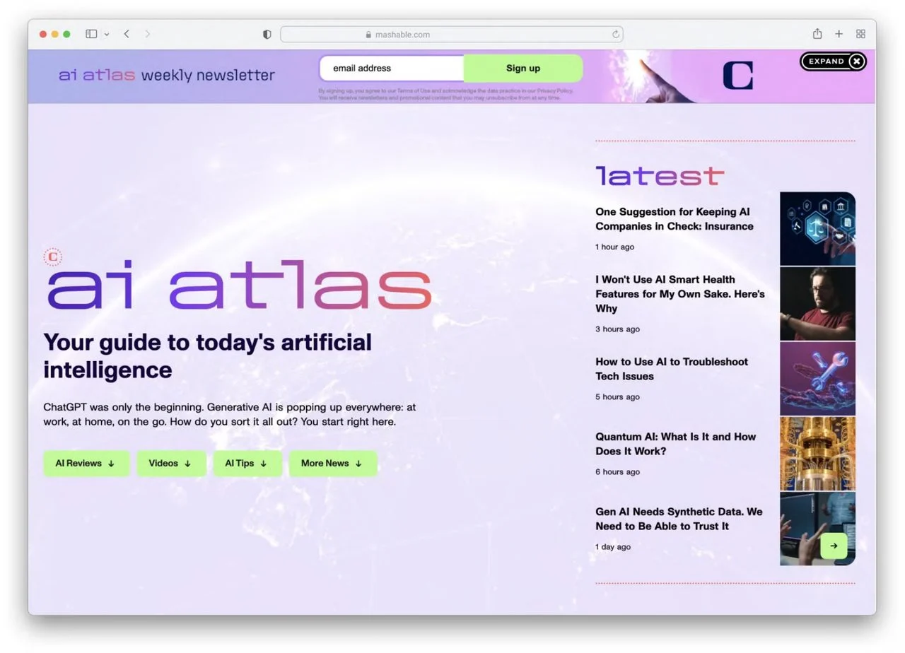
Strong traffic, shallow engagement
The data told a clear story. Users arrived, skimmed the surface and left. For a property built around editorial depth and credibility, that was a UX failure and a business risk to the sponsorship model.
Almost all engagement landed on the content rivers, while the navigation that was meant to guide users, so jump links, FAQs and the glossary, saw close to zero interaction.
Product Design
I led the redesign across research, editorial, sales and engineering. Alongside the visual work, I synthesised the research into product opportunities, defined the information architecture and turned competing stakeholder priorities into one coherent direction.
What the data told us, and what we did about it
I paired six months of page analytics with 12 unmoderated sessions on Userlytics, run as two six-person cohorts, one actively looking for AI content and one just likely to come across it. The patterns were consistent, and each one mapped directly to a product decision.
Making the brand feel more human
Testing surfaced two brand problems. Users felt overstimulated by the page’s colours and visuals, and the palette read as overly feminine for the broader audience we needed to reach. This was the first project where I owned branding end to end, and I anchored the refresh in three moves.
Pull back the colour
Removed the light purple and pulled back the overall colour, so the brand reads as more sophisticated and digital, and a lot less overstimulating.
Add human imagery
More people and fewer abstractions, so users can picture themselves using AI and the page feels relatable.
Lean into animation
Motion graphics (built with our motion design team) make the hub feel modern and guide users down the page.
One destination, two surfaces
The core insight was that AI Atlas was serving two user modes from one experience, passive browsing and active search, and doing neither of them well. I split it into a dual-surface architecture that separated the two modes while keeping the destination together.
Phasing the launch under constraints
Engineering capacity meant we couldn’t ship both surfaces at once. Instead of delaying the whole redesign, I phased it and shipped the Hub first so we could start getting real signal, with the Directory following after.
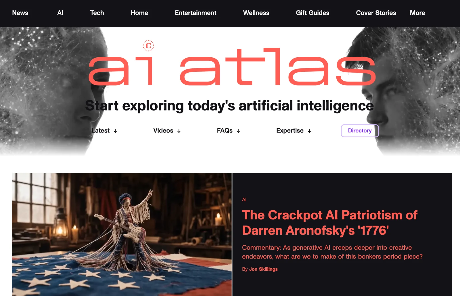
Hub experience
The full hub redesign, with rivers prioritised, persistent navigation and editorial credibility brought forward.
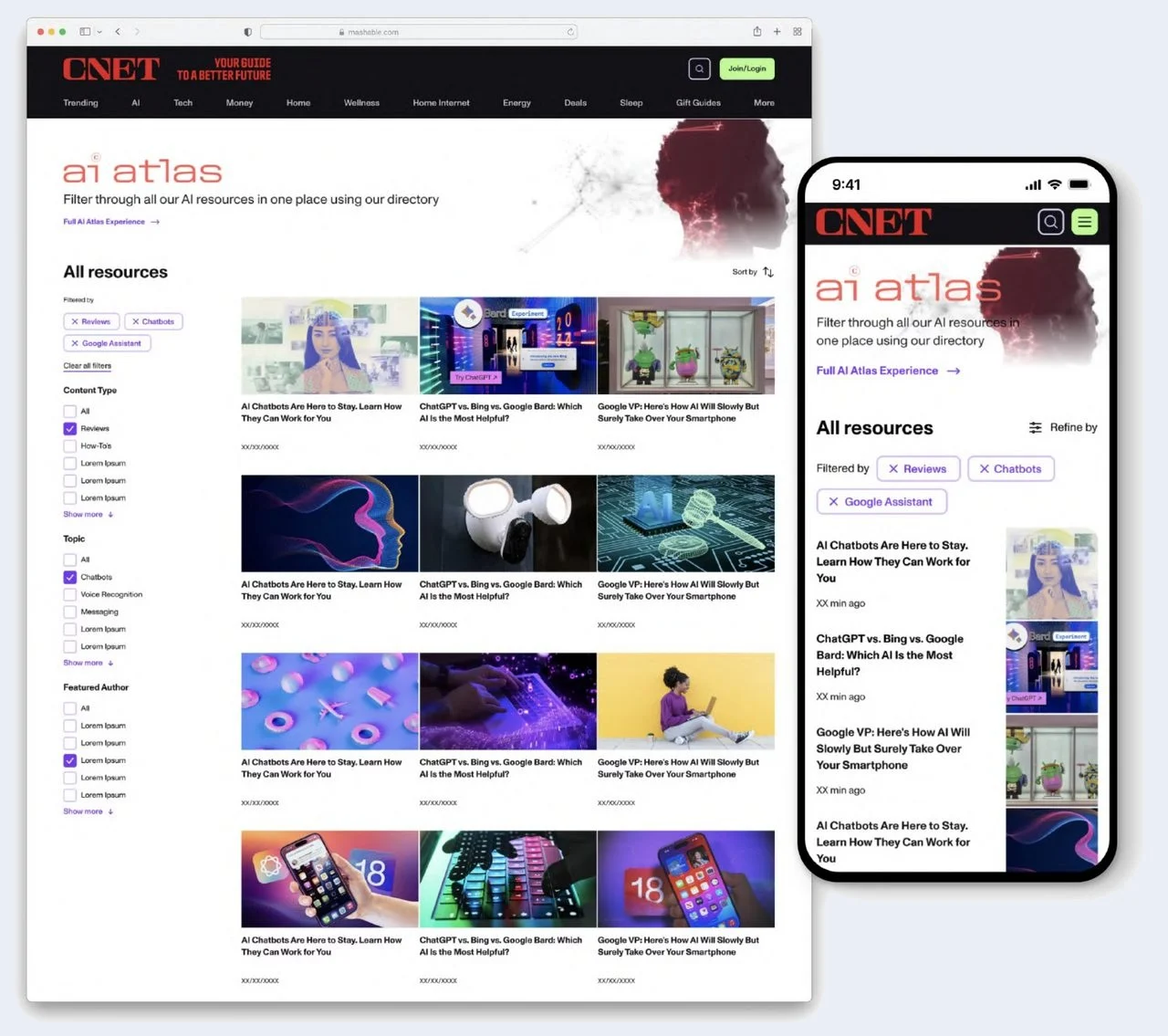
Directory
Filterable directory with cross-surface navigation. Both surfaces now live at cnet.com/ai-atlas.
What shipped, and what it moved
What I’d do differently
The biggest gap was going in without explicit, measurable success metrics attached to each decision. We had clear qualitative goals but not the quantitative targets that make a post-launch evaluation rigorous. It’s a PM habit I’ve picked up since.
I’d also instrument prototypes earlier. Two sponsorships closing on the prototypes alone told us there was more commercial demand than we realised, and testing with sales sooner could have shaped the strategy from the start.