CNET Navigation Overhaul
Rebuilding CNET’s global navigation so millions of readers actually reach what they came for, while balancing findability, SEO and revenue goals.
Where the navigation stood
CNET’s navigation had drifted away from its core job of getting readers to content, and had turned into a commerce-driven menu. The most common complaint in user testing was that people couldn’t find what they were looking for.
Findability was hurting the business
A navigation that hides content frustrates users, and it also caps engagement and starves the high-value pages the business depends on. I framed the redesign around three goals: support findability, follow SEO best practice, and still route readers toward high-value pages.
Product Design
I owned the navigation redesign end to end, working with UX research, SEO and engineering. I synthesised the research, standardised the system and defended the trade-offs with stakeholders.
What testing told us, and what we did
A 30-person card sort rebuilt the taxonomy. Then 12 unmoderated 30-minute sessions, with participants aged 32 to 62, an even gender split, and both desktop and mobile, sharpened the interaction model.
Turning a spreadsheet of links into one system
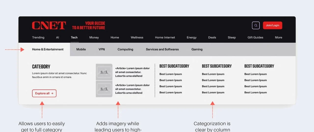
Subcategories ranged from 0 to 17 links, so I built one scalable template with 12 links in three columns, room to feature two high-revenue articles, and a trending module. It’s clear to read by column and easy for engineering to maintain. On mobile it collapses into a dropdown to cut taps.
The template also had to work for search, so before wireframing I sat down with our SEO lead. Three principles from that conversation are built into the structure.
Keyword optimisation
Categories and links are named with terms that actually rank on Google.
Order matters
Top-level topics run from most to least important, since crawlers weight position.
Stay flexible
CNET’s coverage is broad and uneven, so the template has to flex. No two topics are the same.
Midnight or Daylight?
The design team leaned toward a dark treatment, but users had asked for a nav that stands out. Instead of guessing, I prototyped both and ran them head to head.
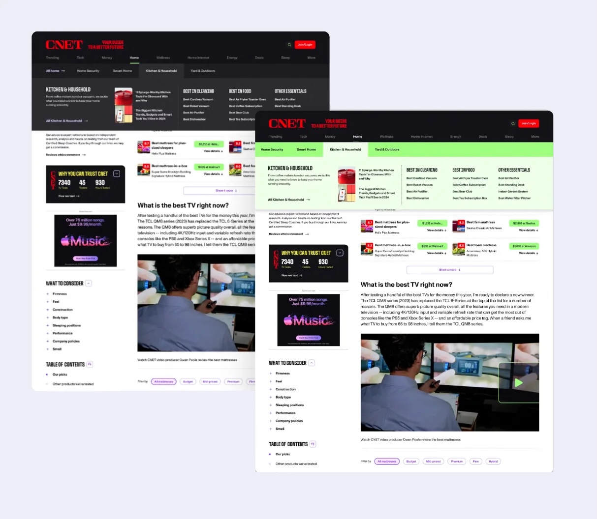
Midnight
A bold dark treatment the design team favoured for its contrast and drama.
Daylight
A lighter, greener treatment that users found clearer and easier to scan. This is the one we shipped.
What shipped, and what it moved
The lighter “Daylight” treatment shipped across CNET’s global navigation. Every subcategory now follows one template, with 12 links in three labelled columns, two featured high-value articles and a trending module. The menu opens on hover, so readers reach what they came for in one predictable motion.
In the first month after launch, page views per session rose 32% (1.24 to 1.64) in site analytics. Before launch, 12 unmoderated usability sessions validated the design. Participants found the article they were given quickly, and they confirmed both the 12-link cap and the lighter treatment. Editorial and engineering also came away with one scalable pattern to maintain instead of dozens of one-off menus.
What I learned
Interactions rose at launch and then flattened a few months later, which was a good reminder that shipping is where the measurement starts. I left with a backlog of hypotheses to test, from colour changes through to a sticky nav.
The hardest call was defending UX against cramming in every high-revenue page. Holding that line, and learning how much structure and keywords drive SEO, is exactly the kind of prioritisation a PM has to own.