CNET Shopping Onboarding
Cutting 48-hour churn on a price-comparison extension by letting people watch the product work, and by prioritising retention over acquisition.
A useful tool people didn’t understand
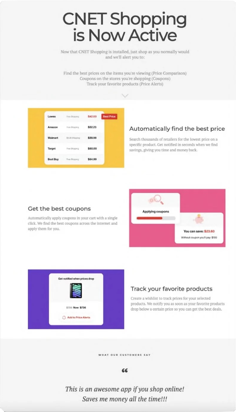
CNET Shopping is a Chrome extension that compares prices across thousands of retailers in real time. The utility was strong, but the experience right after install wasn’t teaching people why it mattered.
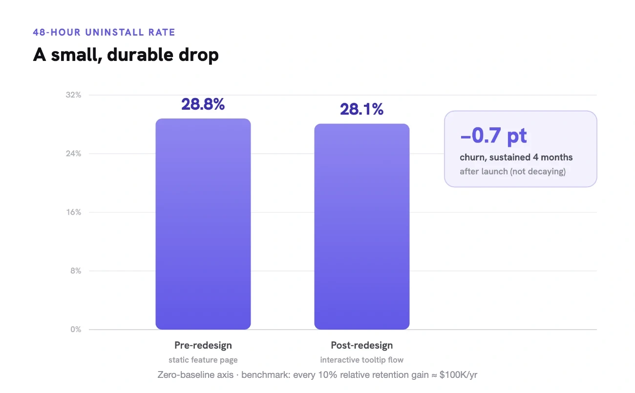
28.8% uninstalled within 48 hours
Exit surveys showed a clear pattern. People found the tool confusing right after install and removed it before they ever saw the value. The only onboarding was a static page that explained the features instead of showing them. My hypothesis was that closing the gap between install and first value would bring retention with it.
Product Design
I led the onboarding redesign with a small team of PMs, copywriters and engineers. I framed the problem as a retention metric, ran the research and made the calls about what to cut.
What testing told us, and what we did
A competitive teardown gave me four principles to work from: immediate interactivity, clear copy, visual demos and progressive disclosure. Eight moderated sessions then pressure-tested the prototype.
The three-step flow we shipped
The final onboarding replaced the static page with an interactive tooltip flow that triggers right after install. People pick a real product, watch the comparison tool fire live, and see the best-price indicator highlighted. There’s no email gate and no pin prompt.
Two of those were hard prioritisation calls. Removing email sign-up meant deprioritising a stated “power-user” goal, and cutting the pin step meant trusting that experiencing the value mattered more than having a reminder. I chose retention over acquisition.
Churn down, revenue up
The redesigned onboarding cut 48-hour churn from 28.8% to 28.1%, which is a 0.7-point drop, or a 2.4% relative reduction in early uninstalls, measured four months after launch. Against the team’s benchmark of roughly $100K in annual revenue per 10% relative retention gain, that works out at an estimated $25K.
It also validated the core bet, which was that people keep a tool once they’ve felt what it does for them. Cutting the email gate and the pin step, and letting people watch the comparison fire on a real product, moved the metric we cared about.
What I learned
I’d designed for CNET Shopping before, so I’d picked up assumptions about what new users “obviously” understood. Recruiting genuinely cold participants was the only way to stay honest about that.
The lasting lesson is a PM one. Prioritising between competing business goals is the job, and sometimes the right call is to deliberately miss one stated goal in order to protect a more important one.