Dossi
Co-founding a social travel app, covering strategy, brand, design system and the build.
What Dossi is
Dossi is a social travel-planning app I’m building with two co-founders from Imperial, Katie (CEO) and Karen (COO). We describe it as part Figma, part scrapbook. It’s one open canvas where you keep the dream, the plan, the group and the memory of a trip together, instead of spread across five apps and a group chat.
I’m the product and technical co-founder, so I own the brand, the design system, the prototype and the build. We’re live at go-dossi.com with a hands-on prototype and an open waitlist.
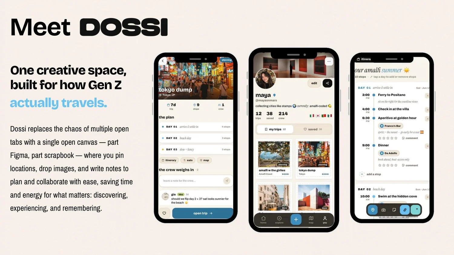
Why planning a trip is broken
For Gen Z travellers, a trip has no home. You stitch it together across TikTok and Instagram for inspiration, Google Maps for pins, a group chat to coordinate, the Notes app for pasted links, and a camera roll you never open again. None of it connects.
So saved videos never become plans, decisions die in the group chat, and trips vanish once they’re over. The hard part isn’t finding inspiration, it’s the gap between saving something and actually going. We’re closing that gap by giving the whole arc of a trip one shared place.
What I own
I sit where product, design and engineering meet. I take what we learn from users, turn it into decisions, and then carry those decisions through to working software. Concretely I own:
The two decisions that shaped Dossi
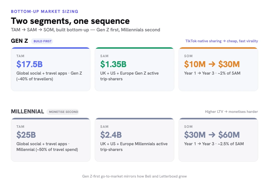
Who we build for first. My co-founders and I built a bottom-up model and segmented it, which put the market for Gen Z travel content, planning and discovery at $15–20B. Gen Z is the right cold-start audience because sharing is TikTok-native and the social graph is strong. Millennials carry higher LTV and monetise harder, so they come second. Beli and Letterboxd grew in the same order.
What we build. Planning is already crowded with AI itinerary generators, Notion and Maps. What doesn’t exist is a social layer for travel. Friends and family rank #1 for travel decisions, ahead of price, and no product connects discovery through people you trust with the planning itself. I pulled apart every adjacent app (Spots, Amigo, Corner, Raya’s Places, Sensespace) against the three jobs the current workflow does badly, which are discover, plan and remember. Each one owns a single slice. Dossi sits at the intersection, with a canvas-based UX and no invite wall.
The risk I pressure-tested. People travel only a few times a year, so a social travel app can struggle to build a habit. The social layer has to earn attention between trips through discovery and memory, not only through planning. That shaped the discover, plan, remember loop the product is built around.
Why the brand was a strategy problem
Most products in this category pick a lane. TripIt and Wanderlog are utilities, TikTok and Pinterest saves are inspiration. We’re trying to hold both, so the identity had to make one app feel credible for dreaming and for doing. The name came first. Dossi is short for dossier, the file you compile on a place before you go and the record you keep after.
I set three criteria. It had to feel like the trip and not the logistics, survive past the current trend cycle since the product stores memories for years, and sit back behind user photography since the content is the product. I explored six directions across about 30 marks. The stamps were my favourite, but they felt too literal to build a whole identity on, so the final mark is the bare wordmark with the postal language kept as texture.
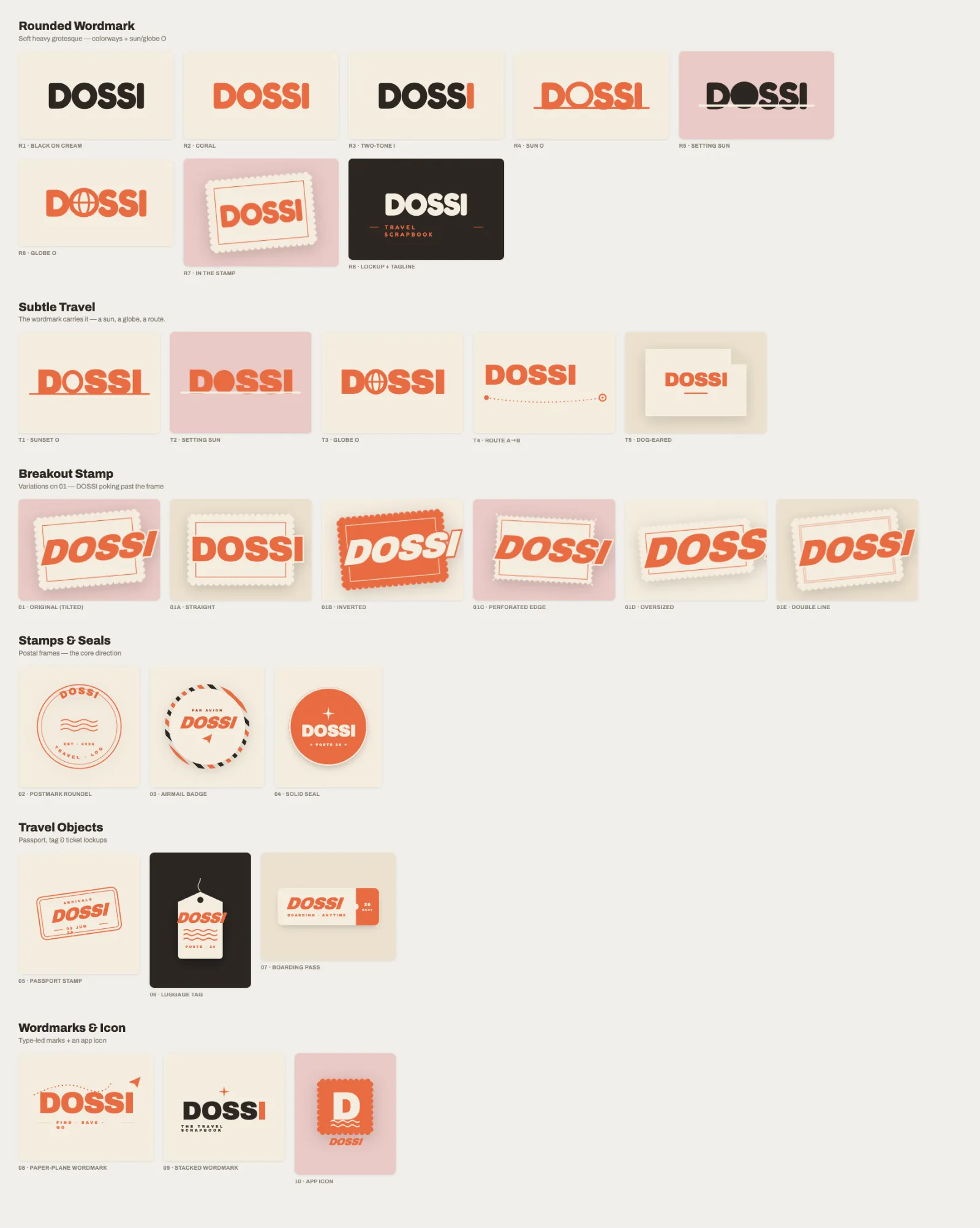

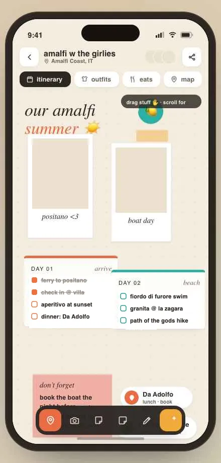
The coral era. The first hi-fi pass used the coral stamp brand. The structure landed straight away, but the styling skewed too Gen Z to feel timeless, with heavy shadows, emoji in the UI and coral that read loud instead of warm. A memory product ages with whoever downloads it first, so styling that feels current now can date the archive later. That became the rebrand brief.
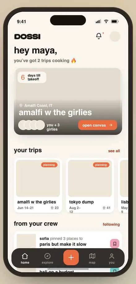
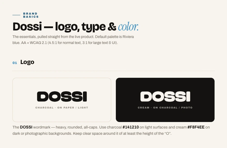
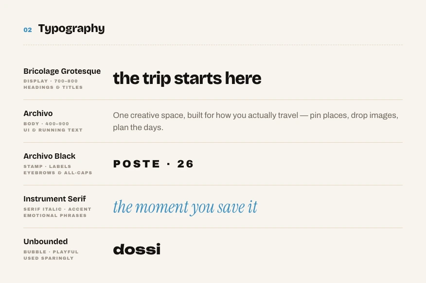
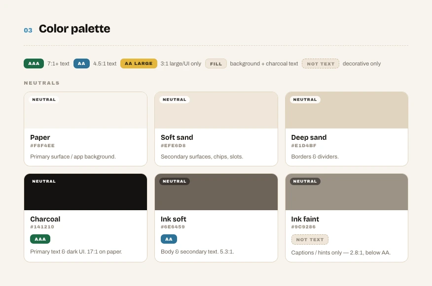
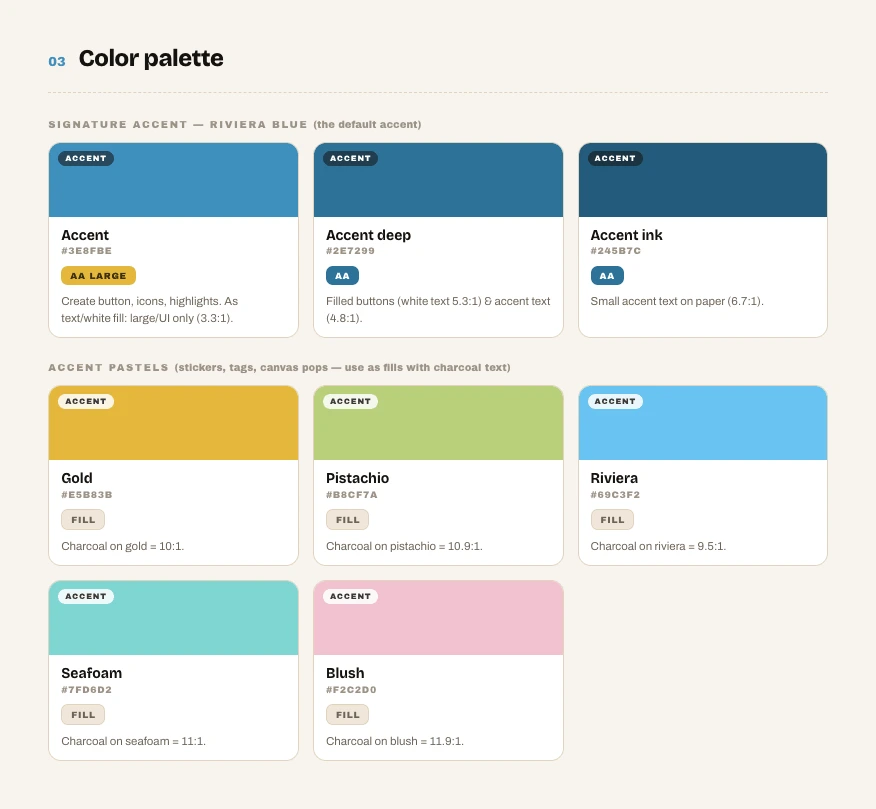
The design system. The rebrand kept the postal soul and dropped what dated it. Charcoal ink on warm paper, Riviera blue as the signature accent, and pastels for pops on the canvas. Each typeface has one job, and every colour pairing ships with its WCAG grade. I’m the only designer and I’m also building the product, so the system is what lets me move quickly.
What testing changed
We started with an advantage, since the three of us are Gen Z travellers who plan trips in exactly this broken way. We still treated that as a hypothesis to validate, so we ran interviews and a survey to map the real planning journey, then one round of reaction sessions on the live prototype on our website with 12 participants. That round reshaped the feature set more than any internal critique did. Every decision below traces back to a specific signal.
| Signal from testing | Insight | Decision |
|---|---|---|
| “Was the slanted text a design choice? I don’t like it.” | Playfulness was reading as sloppiness. | Straightened and simplified the canvas, and fed this into the wider strip-down of the brand. |
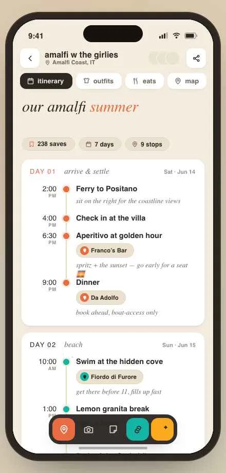
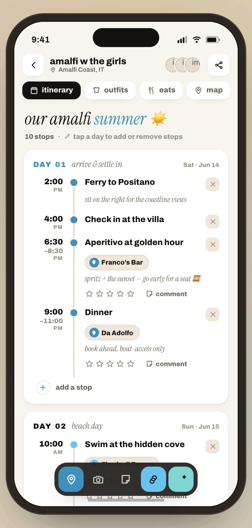
| Testers wanted a real plan, not sticky notes. | Scrapbook energy belongs to dreaming, and the itinerary is for doing. | Rebuilt the itinerary as a timed, day-by-day layout with stops, notes, and bookings. |
| “Itineraries have a saved # to prove quality.” | Nobody acts on a stranger’s plan without a trust signal. | Public itineraries and explore cards carry save counts. |
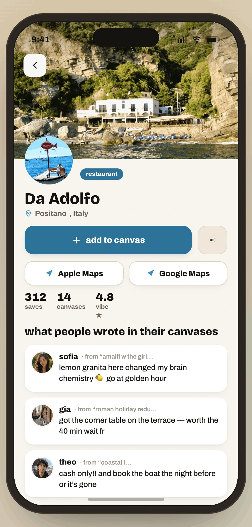
| Testers wanted to tell friends and influencers what worked. | Post-trip knowledge is the content that keeps paying off. | Every public itinerary stop gained a comment thread. |
| Planning ends where navigation begins. | Owning navigation would trap users instead of serving them. | Place cards deep-link straight into Google or Apple Maps. |
| TikTok import went unnoticed. | Our most differentiating feature was hidden at the moment people needed it. | Moved social import into the main add-to-canvas flow; imported videos can be re-run to extract more places. |
What we scoped for the MVP
From the strategy I scoped the MVP around the three jobs the current workflow does badly: discover, plan and save, and remember.
Discover. The riskiest assumption in our model was the save-to-plan gap, so the anchor feature of the MVP is reel import. You paste a TikTok and Dossi extracts the places onto your canvas. We prioritised it over collaborative editing because it attacks the moment where the workflow actually breaks.
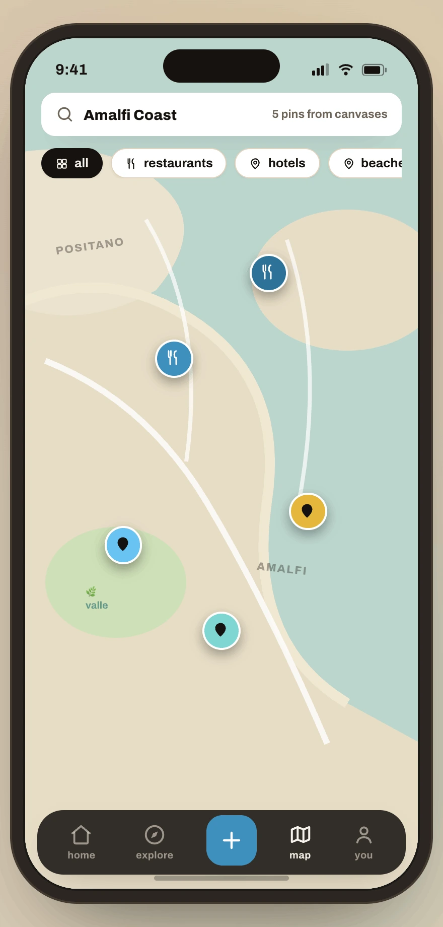
Plan and save. Saves organise automatically into one living map instead of a flat list. That’s a deliberate trade against folder-style organisation, which our interviews showed people set up once and then abandon.
Remember. The same collection that held the dream and the plan becomes the record of the trip. This is our answer to the habit risk, since memory earns attention between trips, and a shareable record feeds the next person’s discovery.
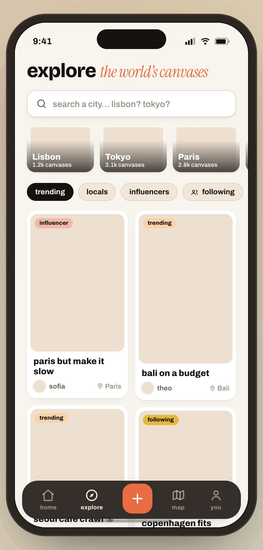
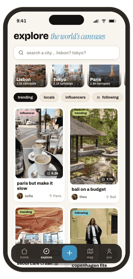
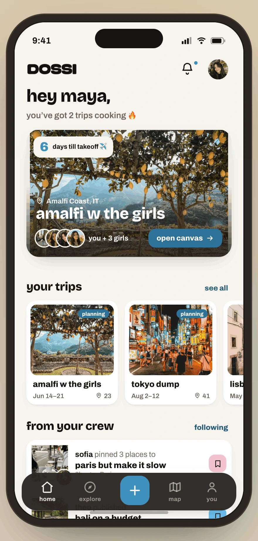
The final prototype. The shipped prototype covers the full loop, with an explore feed of real travellers’ canvases, a collaborative trip canvas, a structured itinerary with comments and ratings, a pin map, and place cards that carry bookings. Real photography replaced every placeholder.
How the build works
Three technical calls shaped the product, and each one started as a design problem.
Keeping interpretation and facts apart. Reel import is the anchor feature and the riskiest assumption, so it’s where a wrong answer costs the most trust. I split the job in two. A small, fast model handles interpretation only, so it reads a caption and pulls out fuzzy place references like the natural wine bar in Kreuzberg with no name attached. The Google Places API owns the canonical facts, so address, opening hours and coordinates, all keyed by place_id, and nothing lands on a canvas until it resolves to one. That keeps a hallucinated address off someone’s trip, and because every save carries the same place_id, one spot aggregates across trips instead of splintering into near-duplicates.
A reactive backend. A multiplayer canvas is a design promise, since two people open the same trip and expect to watch each other move. Convex live document sync is what makes that true. The canvas came first and the infrastructure followed it.
Scoped agents in Claude Code. Building alone, the design system is the first thing to slip once I’m deep in application code. I run three scoped subagents against a shared context file, one for the design system, one for backend and realtime, and one for the canvas engine. Each holds only what it needs, so work on the canvas can’t quietly redefine a token. The system is what lets me move quickly, and the agents are how it survives the shipping.
Where it stands
Reflections
Co-founding Dossi has been my clearest step from designer to product owner. The discipline that’s changed me most is sequencing, which really means deciding what not to build yet. The market model and segmentation didn’t just validate the idea, they forced a beachhead, a GTM order, and the call to build a social product instead of another planner.
Owning the whole arc, so the brand, the prototype and the code, taught me how much faster product decisions get when the person scoping the feature can also build it. The biggest feature decisions all came out of one round of testing a mockup video, which was easily the cheapest piece of research I’ve done.