Overview
Della makes splitting expenses with friends easier. When you pay with your card, Della texts you the charge. Just reply with who was there, and Della works out what everyone owes. Your friends can pay you back through Venmo, Zelle, PayPal or Cash App.
Della doesn't handle the money itself, which keeps operating costs down.
The problem
Della started as something we kept hearing about while researching Dossi, our travel app. Nine of our first 12 interviewees brought up the frustration of splitting expenses, even though we hadn't asked about payments.
It made sense. On a group trip or night out, someone usually pays for everyone. Then that person has to figure out what everyone owes, request the money and sometimes remind people to pay.
We decided to explore whether we could make that process easier.
My role
As co-founder and CTO, I also lead design at Della, taking the product from early research through to a working prototype.
We were working on a tight timeline, so I was responsible for creating Della's visual identity, designing all the user flows, building the interactive prototype and producing the marketing website and materials within a few days.
During ideation, I also helped evaluate technical feasibility, estimate development costs and manage our technical budget. Beyond the designs, I built a functional version of Della using Plaid's sandbox, allowing us to test the core experience with simulated transaction data.
Research
We conducted 40 interviews to understand how people split expenses and where things tend to go wrong.
I built a coding framework using the first few interviews, then used Claude to code the remaining transcripts. I reviewed its output against the original responses, reducing roughly 30 hours of analysis to two.
I also used Claude Code to help with a desk audit of blog posts and 332 US App Store reviews of competing products.
A few findings stood out:
The person who pays ends up doing all the work
They're responsible for calculating everyone's share, requesting payments and following up when someone forgets.
Asking for small amounts can feel awkward
Even when someone is owed money, they don't always feel comfortable asking for it.
Not everyone wants to split evenly
Most of our interviewees split bills evenly, but studies we found during our desk research suggested that around half of Americans prefer to itemize expenses.
People want to use their own cards
Card choice matters, particularly when people are trying to earn points or rewards.
Mapping the experience
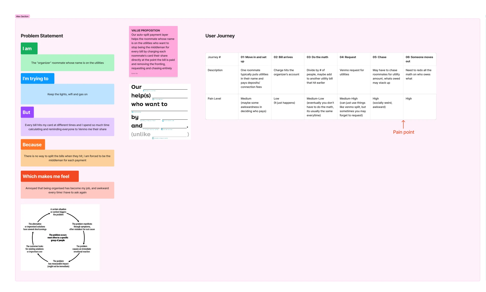
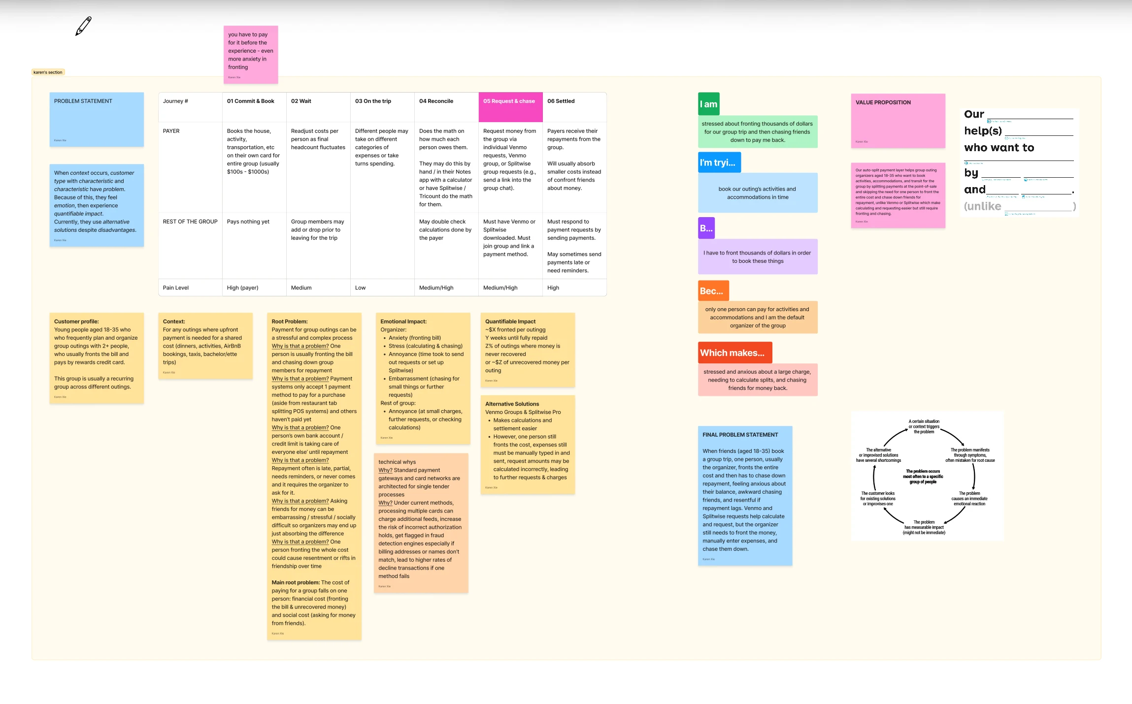
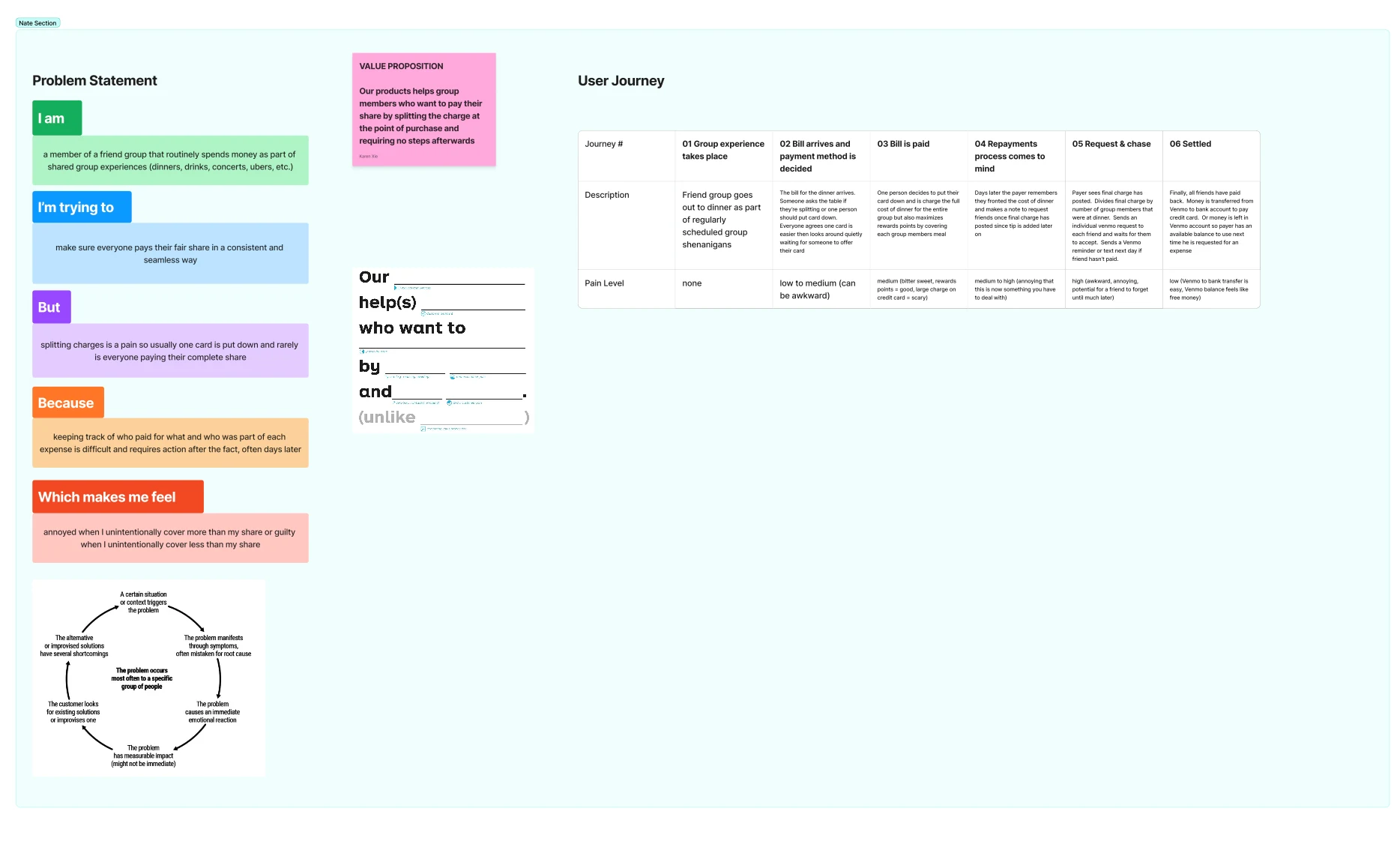
Each of us mapped a different situation: a group trip, dinner with friends and shared household expenses. I took the roommate scenario.
Across all three journeys, the biggest frustration wasn't necessarily calculating the split. It was having to ask people for money afterward.
Looking at existing products
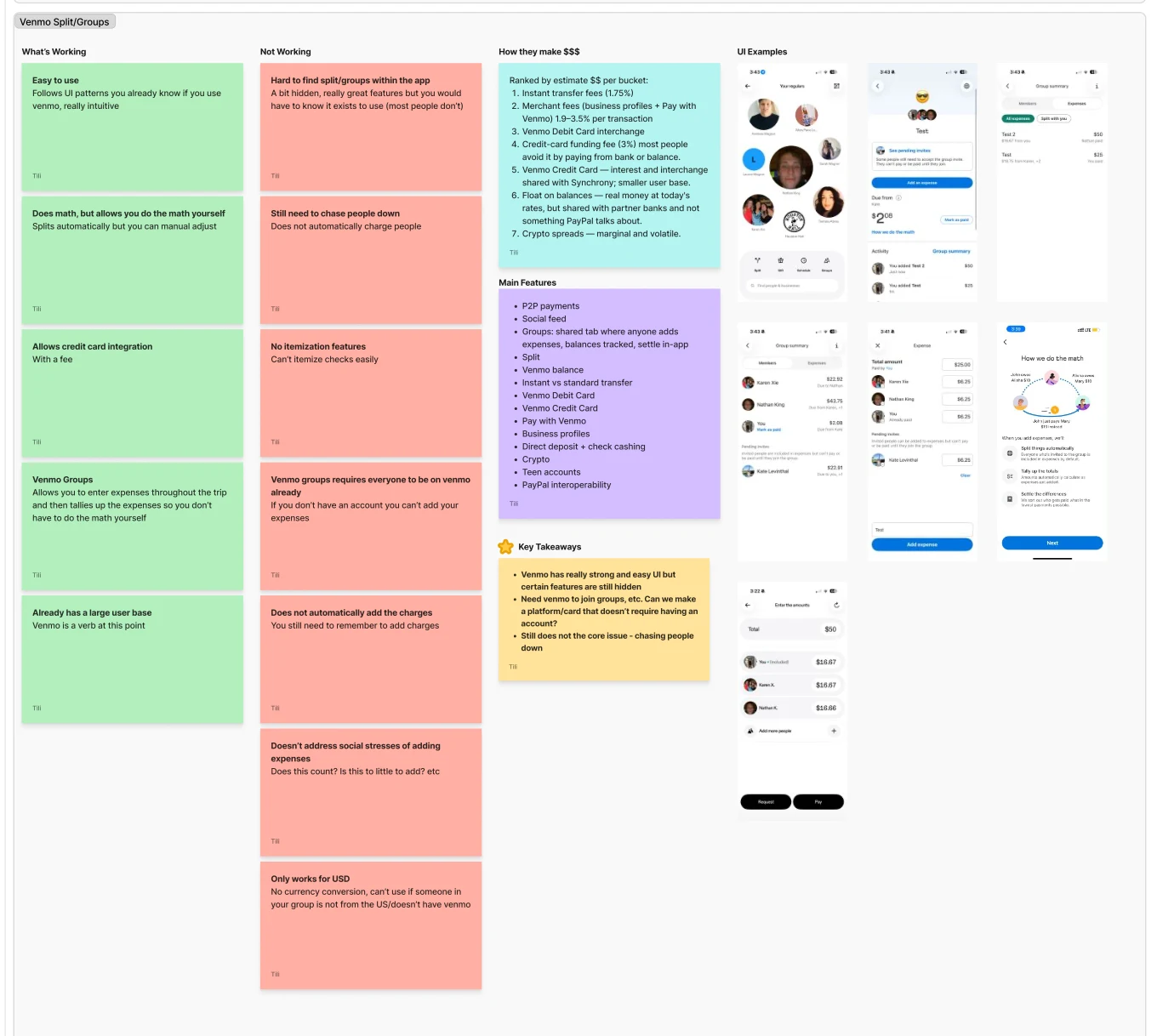
We reviewed seven competitors to see how they handled shared expenses. Most focused on tracking purchases, calculating shares or requesting repayment.
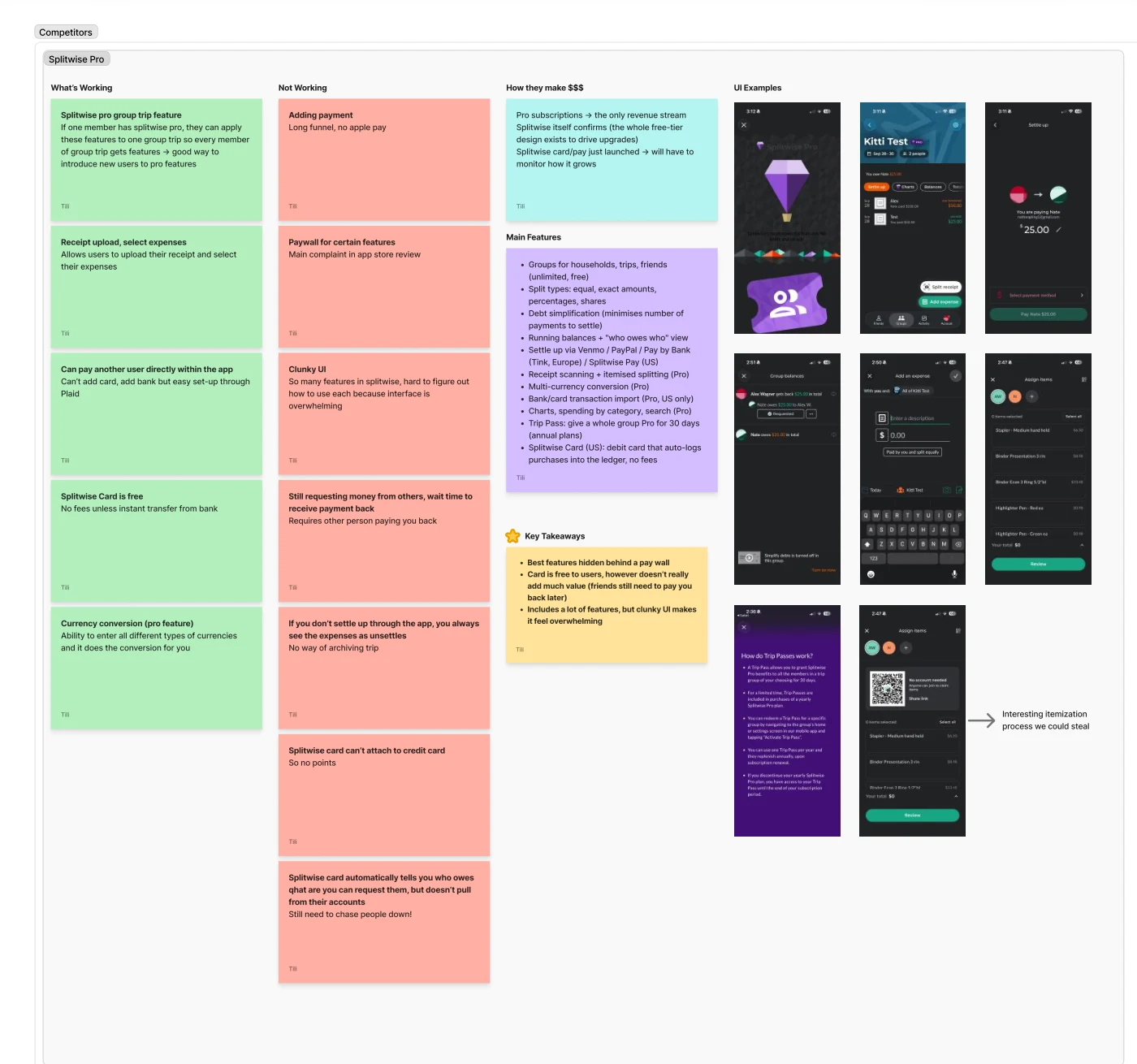
After three weeks of research with my co-founders, I started sketching flows by hand. From there, I used Claude Design to create the product designs, clickable prototype and website over two days.
Design decisions
Let people split expenses the way they'd text a friend
I didn't want people to have to open an app and fill out a form every time they paid for something.
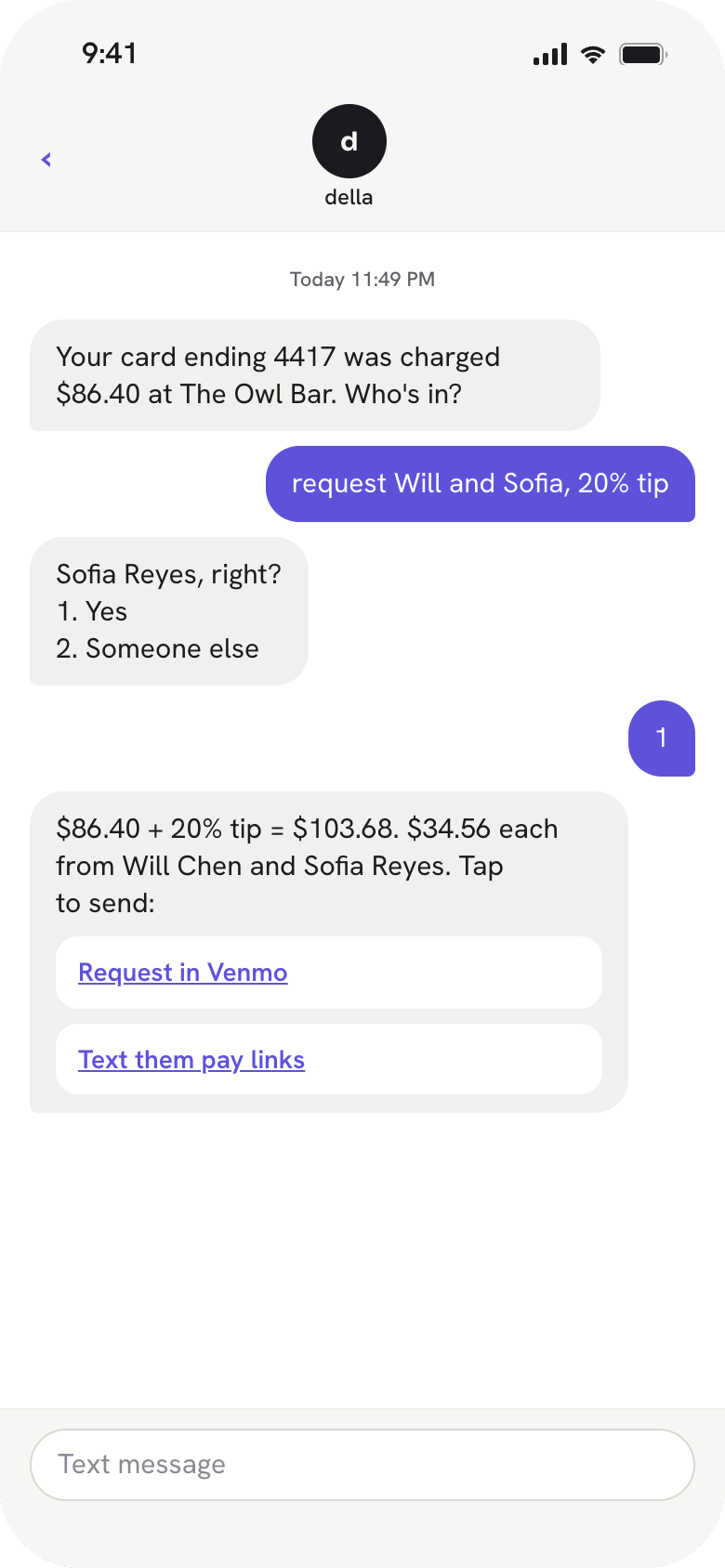
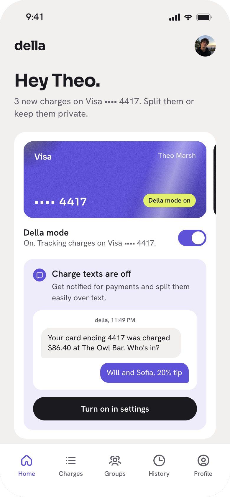
Instead, they can reply to a charge notification with something like "Will and Sofia, 20% tip."
Of course, that creates some ambiguity. If Della isn't sure which Sofia you mean, it asks a quick follow-up with numbered options, so you can respond with a single digit.
Before sending any requests, Della confirms the calculation:
"$86.40 + 20% tip = $103.68. $34.56 each."
Show people how texts work before they turn them on
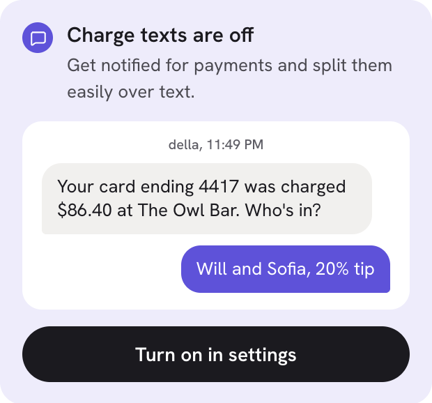
Charge notification text are off by default.
Rather than immediately asking people to enable them, I added a sample conversation to the home screen. This gives people an idea of what they'll receive before deciding whether to turn the feature on.
Keep different splitting options in one place
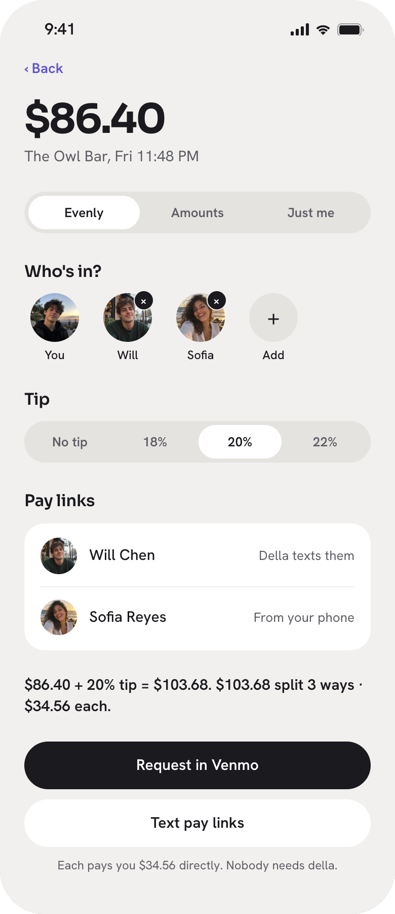
Not every expense should be divided equally, so the split sheet supports three options: Evenly, Amounts and Just me.
Tips can be added with one tap (18%, 20% or 22%), and the amount each person owes updates as you make changes.
For custom amounts, Della also checks that everything adds up to the total. I wanted people to be able to make adjustments without having to double-check the math themselves.
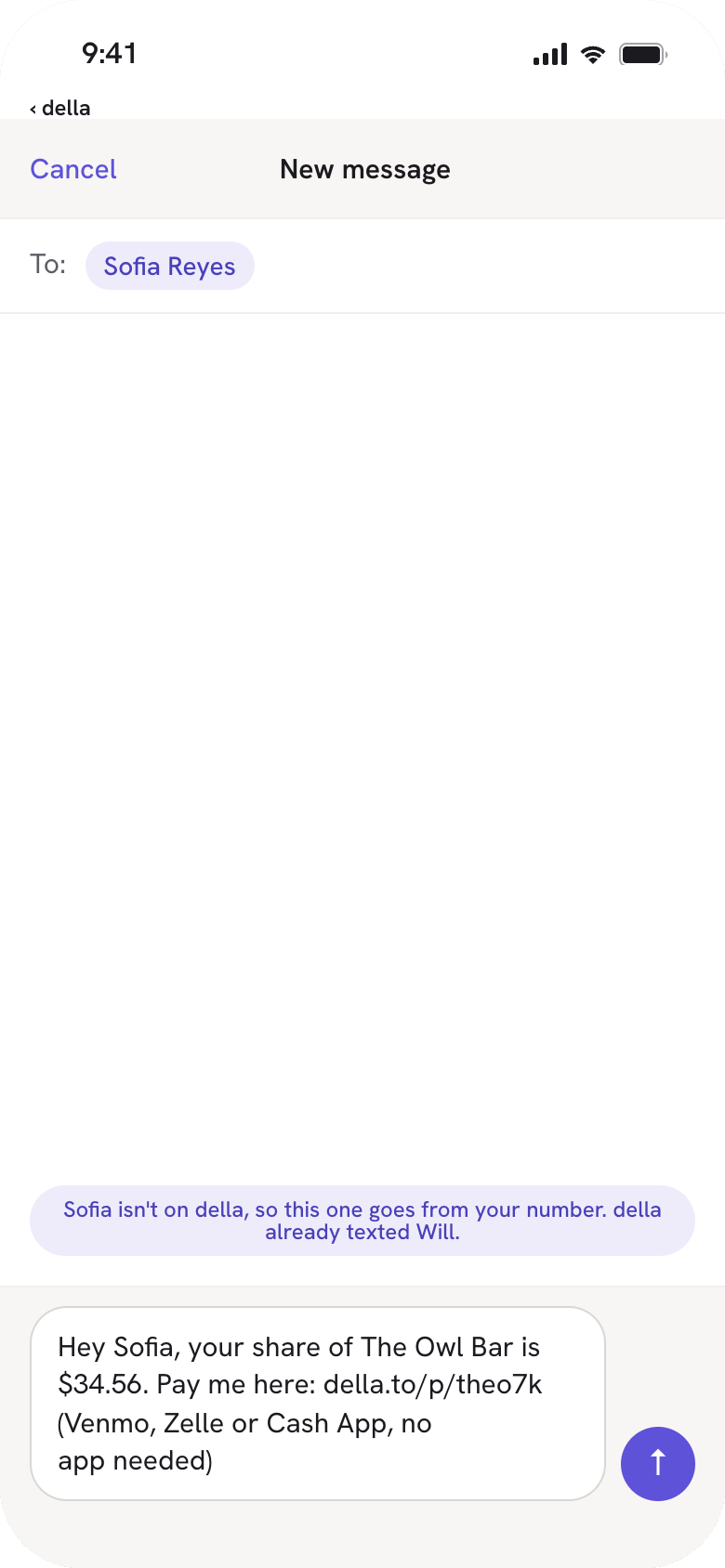
Don't require everyone to have Della
One thing I wanted to avoid was making someone convince all their friends to download another app just to get paid back.
When you're splitting a charge, Della shows whether it can text someone directly or whether the message needs to come from your phone.
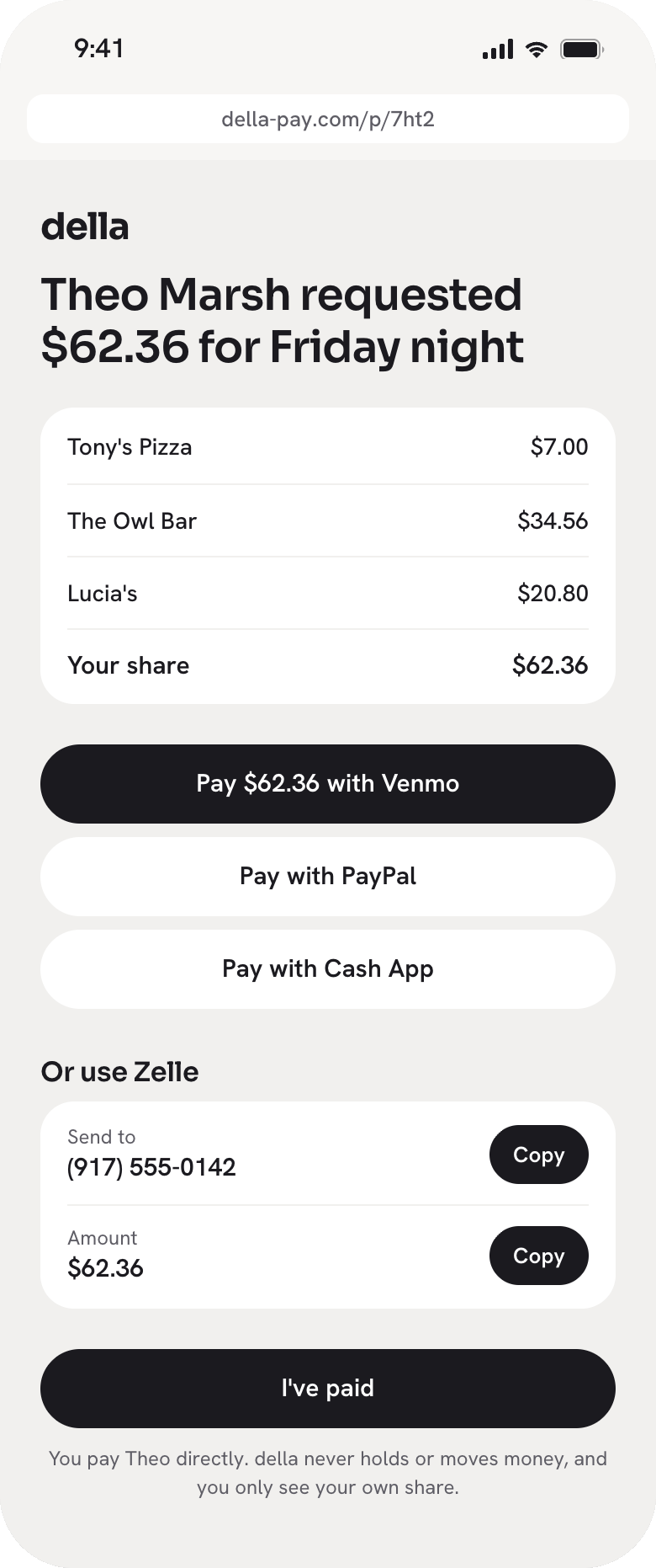
Friends without Della receive a prefilled text with a payment link. The page shows what they owe for each charge, along with options to pay through Venmo, Zelle, PayPal or Cash App.
Account for what happens when things don't go perfectly
I spent time designing the less straightforward states, too.
Charges have clear labels, including "Not split yet," "Just you" and "Split 3 ways · texted," so people can see what's happened without opening each transaction.
Pending charges also need special treatment. The final amount can change, particularly when a tip is added. Della uses the final amount and send a follow-up if the charge increases.
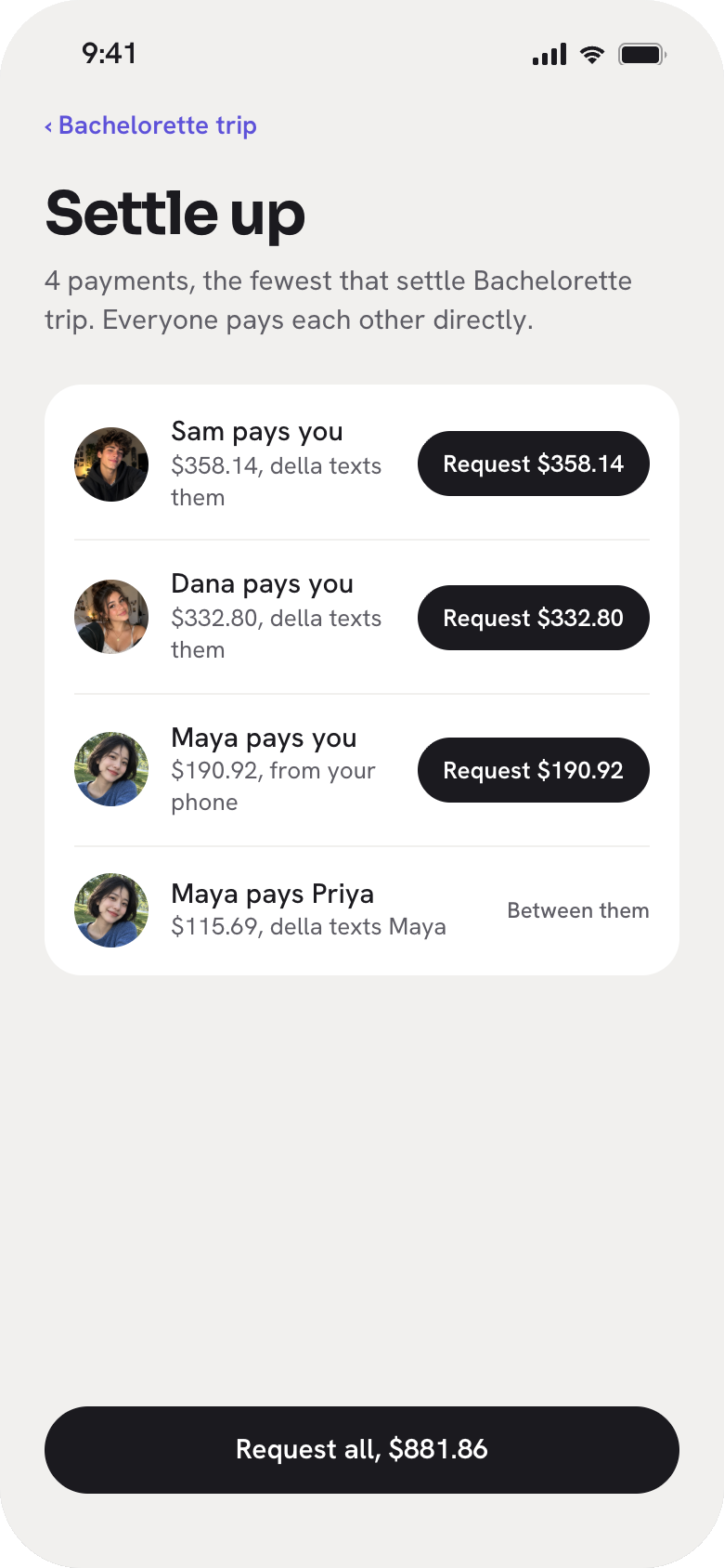
For groups with multiple outstanding expenses, I designed a Settle Up feature that calculates the fewest payments needed to clear everyone's balances.
Tradeoffs
Making texts quick without getting the split wrong
The appeal of splitting by text is that you can do it in one reply. But natural language isn't always clear, especially when people have similar names.
I designed the flow to ask for clarification only when needed. Straightforward splits stay quick, while ambiguous replies get an extra confirmation step.
Not every expense needs a group
I didn't want people to create a group just to split dinner once.
Individual charges can be split without one, but running balances are only available within groups. It's a tradeoff that keeps one-off expenses simple while still supporting people who regularly share costs.
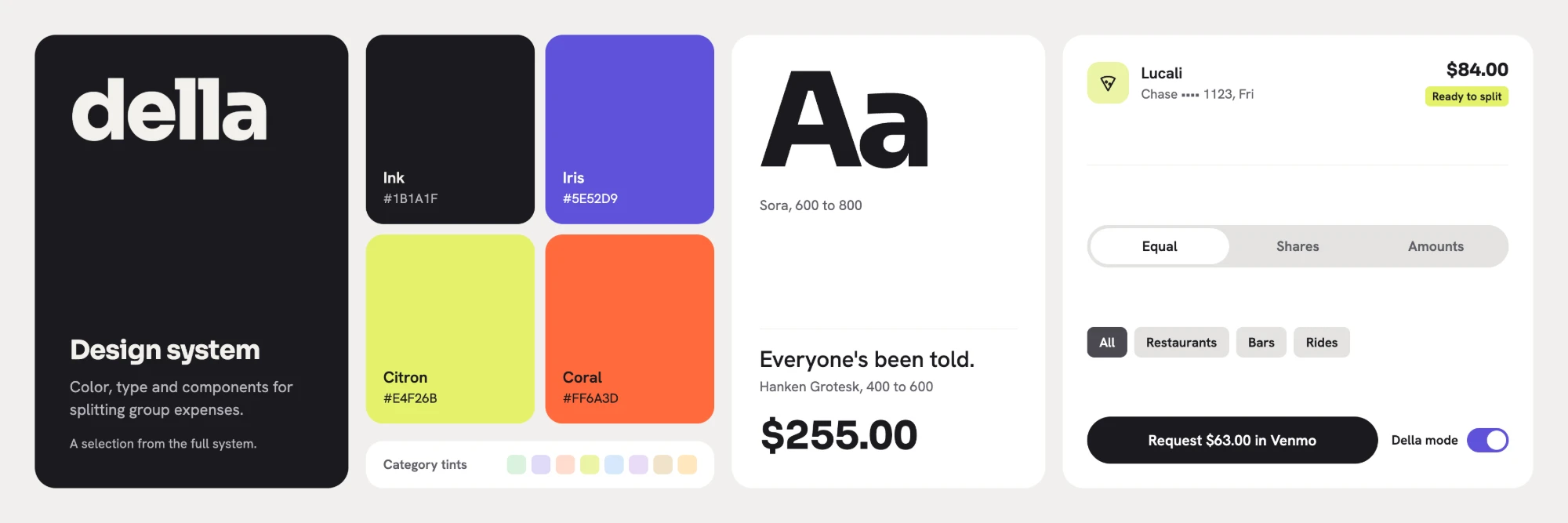
Brand and design system
I wanted Della to feel more like a product you'd enjoy using than a traditional finance app.
When charge texts are enabled, the card flips to Della's iris gradient. It's a small visual cue that makes the change in status obvious, and gives the interaction a little personality.
For the brand imagery, I went with a film photography look, inspired by the popularity of disposable cameras among Gen Z.
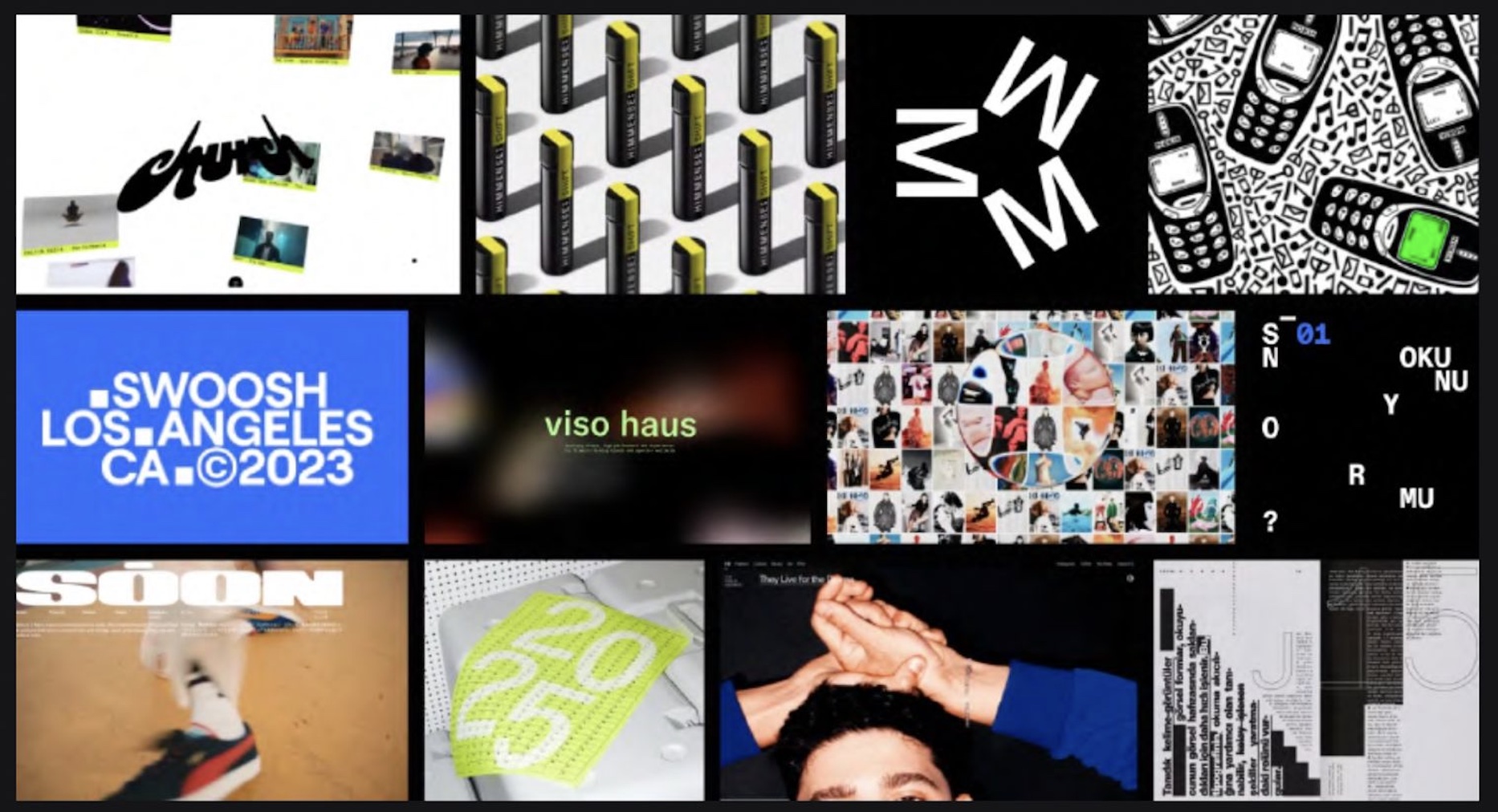
I maintain the design system in Claude Design using a custom design system skill. The skill includes accessiblity check so we meet WCAG AA accessibility standards.
Website
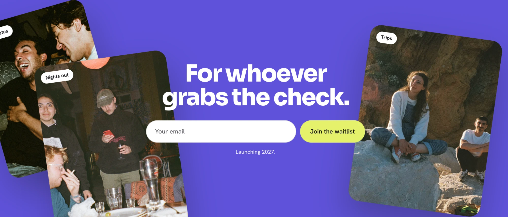
The main goal of the website is to get people onto the waitlist.
I kept the signup button visible as people scroll and used animations to demonstrate how Della works, rather than relying on long explanations.
The hero introduces the card flip, and the texting feature appears immediately below it because that's what makes Della different from other expense-splitting products.
I also included a section on privacy and card data. We're asking people to connect their cards, so explaining how that information is handled felt important.
Where we are now
The website and waitlist are live, and we're planning to launch in 2027.
We have a clickable prototype and a functional build connected to Plaid's sandbox using test transaction data. The AI-powered text replies are designed but haven't been built yet.
We've shared the prototype internally, and the next step is testing it with users.
Reflection
This project reinforced how useful it is to have research to come back to when making design decisions. Rather than designing around what I thought people would want, I could point to specific frustrations from our interviews and think through how to address them.
It was also interesting to design a product around texting rather than a traditional app experience. That meant thinking more carefully about how people naturally communicate, what happens when a message is unclear, and when it's worth adding an extra step to prevent mistakes.
Using Claude Design also changed how quickly I could work. I was able to move from sketches to a full prototype in two days, which gave me more time to think through edge cases and refine the experience. The next step is seeing which of those decisions hold up in user testing and where we've made assumptions that need to change.